How a two-year design refresh transformed a 15-year-old logo into a symbol of public service, accessibility, and digital-first governance
Dublin City Council has served as the capital’s trusted public authority since 1841, when it was affectionately known as “the Corpo.” The Local Government Act of 2001 brought the name we know today, and in 2002, the Three Castles brand was commissioned. That mark served the city for nearly a quarter of a century until January 28th, 2026.
When Stephen Walker, Head of Creative and Digital at Carr Communications first started working with Dublin City Council’s existing brand, he noticed the same significant issues that Dublin City Council staff had been dealing with for years: the iconic three castles logo lacked the impact to stand on its own, the left-aligned lockup was awkward and restrictive, it didn’t conform to current Irish language requirements and the logo lost all accessibility in single colour applications.
A City Transformed
Ask any adult in Dublin about how the city has changed since 2002, and they’ll describe a transformation. A capital once marked by poverty and emigration has become a thriving hub for global business, with EU headquarters for financial and tech giants occupying the once-abandoned Docklands.
But Dublin is more than an economic powerhouse; it’s a living organism, a dynamic community where people of all ages, cultures and faiths call home. This raised a fundamental challenge: how do you create a brand that such a diverse population can identify with?
Evolution, Not Revolution
“A brand refresh is different to a rebrand,” Walker explains. “You’re not trying to get rid of everything that’s there. You’re trying to tweak it and update it into what you want the brand to be.”
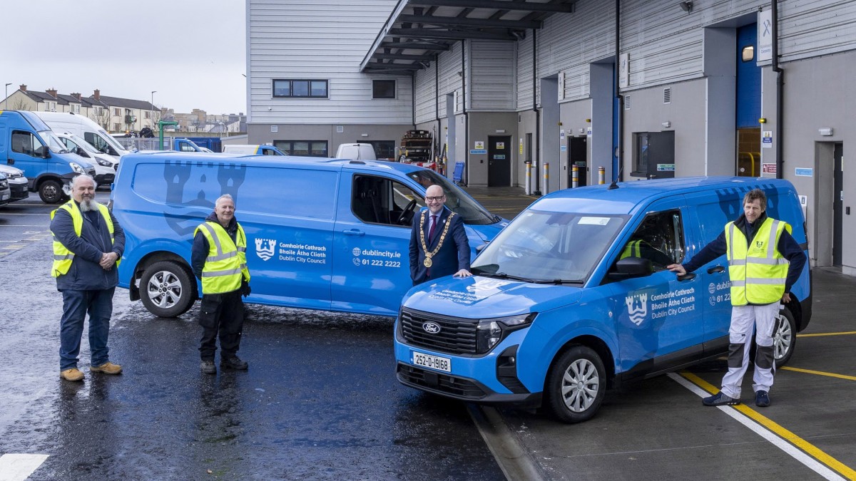
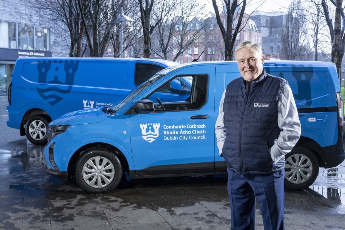
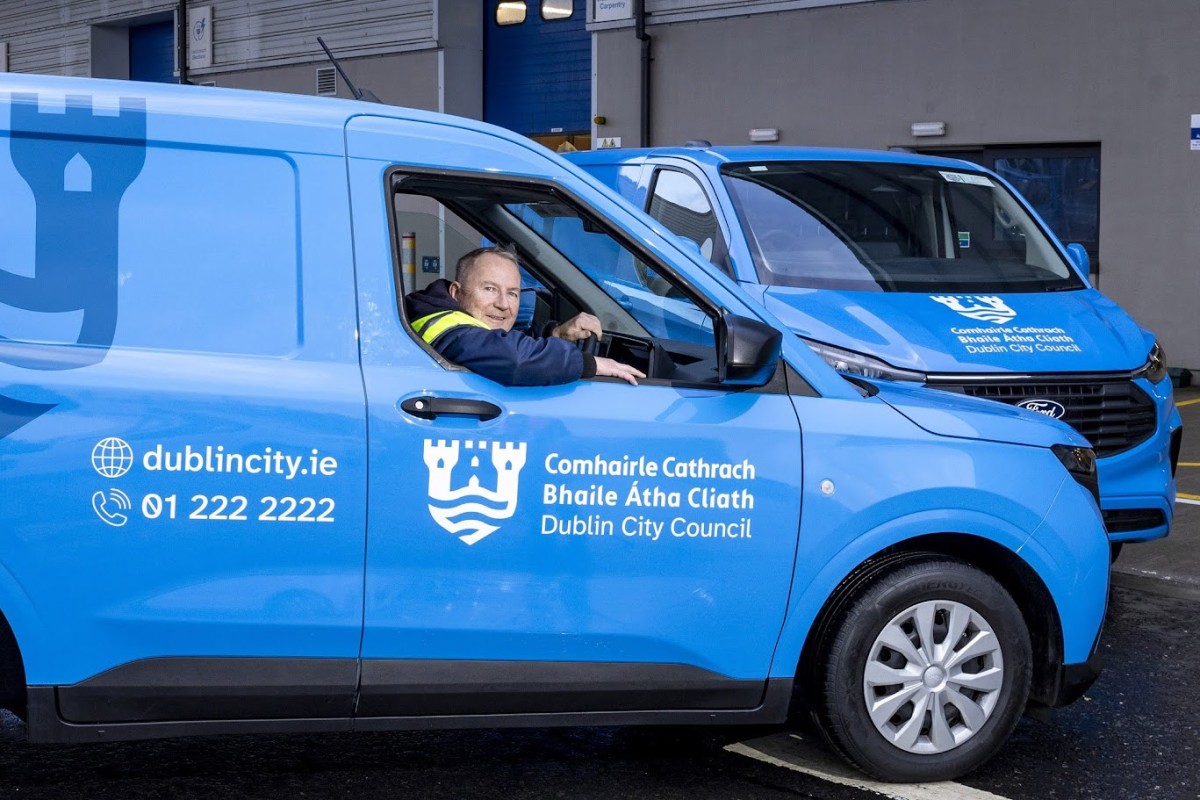
Rather than discard the goodwill built around the three castles mark, the refresh allows old and new to coexist during transition; crucial for an organisation managing everything from libraries to waste services across Ireland’s largest city. This allowed for a high impact, low cost rollout – everything was updated immediately for digital applications but physical items don’t need to be replaced until they are end of life.
The need for change crystallised around three fundamental problems: lack of impact, poor accessibility, and no consideration for digital applications.
Accessibility across the board
For Dublin City Council, inclusivity and building public trust were the top priorities. The old brand presented a severe accessibility challenge, failing to properly serve everyone within the council’s boundaries, including Dublin’s increasingly multicultural population. In single colour applications, for example, the bilingual lockup became completely illegible, leaving no way to differentiate between Irish and English text. Introductions such as new hyperlegible typography, an adaptable logo mark and a colour palette that is AAA rated on the WCAG (Web Content Accessibility Guidelines) now ensure a brand that is accessible and works well across all possible usage cases.
Beyond these fundamental accessibility requirements, the brand also needed to function in a modern landscape. Designed primarily for letterheads and printed materials, the old identity simply couldn’t keep pace with how residents actually engage with the council today. “The previous logo and brand had been done over twenty years before, when digital use wasn’t really a consideration,” Walker notes. Yet, as he points out, “A high proportion of everything we do now is online, on screens, digitally.” Today’s residents encounter the organisation regularly through websites, social media, digital signage, and mobile apps, making a clear, screen-friendly, and accessible design more essential than ever.
The Design Solution
The new logo solution cleverly expands on the three castles motif while making the brand unmistakably Dublin. The new logomark incorporates three elements: the original three towers (with the third created through negative space), the shield device from Dublin’s historic crest, and a stylized representation of the River Liffey.
“The three castles weren’t enough to make it synonymous with Dublin,” Walker explains. “The Liffey is synonymous with Dublin. The shield device represents the role of Dublin City Council as caretaker of the city.”
This shift from “authority” to “caretaker” permeates the entire design philosophy. Where the old mark communicated institutional power, the refresh emphasises service and stewardship.
The typographic treatment ensures the bilingual lockup meets legislative requirements while remaining functionally multilingual. Irish text appears first, but clever use of font weights and a hyper-legible font for the English allows non-Irish speakers’ eyes to immediately find the language they understand.
“Irish readers will read the Irish first. English readers will read the English almost immediately,” Walker explains. “It’s multiculturally usable.”
A Rigorous Process
What might seem like a simple logo evolution required an exhaustive three-phase process spanning two years: discovery (five to six months of research), ideation (hundreds of designs tested against impact, accessibility, and dual-use criteria), and building a comprehensive brand suite with templates, fleet designs, and extensive guidelines.Multiple rounds of feedback from Coimisinéir Teanga (the Irish Language Commissioner) ensured legislative compliance before final approval.
Trust and Recognition
For Walker, the brand serves dual purposes. “There are so many touchpoints where people interact with Dublin City Council every day,” he explains. “It’s really important that it’s easy to recognise services provided by their local government. It builds trust that public value is being delivered.”
Dublin City Council understands that trust is hard to win and easily lost. When something is prominent and professional-looking, people instinctively trust it.
But the brand also gives recognition to council staff for work that often goes unnoticed. “By having a really prominent, easily identifiable brand, suddenly people are walking by and recognising Dublin City Council services.”
Looking Ahead
Walker says, “we hope Dublin City’s new brand mark will instil a sense of trust and pride from everyone across the island when they visit the capital.”
Walker’s ultimate hope is that the logomark becomes so synonymous with Dublin and Dublin City Council that the text becomes unnecessary. More immediately, he hopes council staff embrace and take pride in a design that represents their commitment to the city.
The Liffey has flowed through Dublin for millennia. Now it flows through the city council’s brand identity too; a symbol not of authority, but of the continuous care required to serve a living, breathing city.